← All work
Client project · Rebuild complete, awaiting publication

Aluna Luxe

A Shopify rebuild shaped around mobile shopping, clearer product decisions, verified store information and a more deliberate path from discovery to purchase.
Year
2026
Role
Strategy, ecommerce UX, design, Shopify engineering and QA
Type
Digital experiences · Systems
  • Shopify
  • Ecommerce strategy
  • Mobile UX
  • Content governance
  • Quality assurance
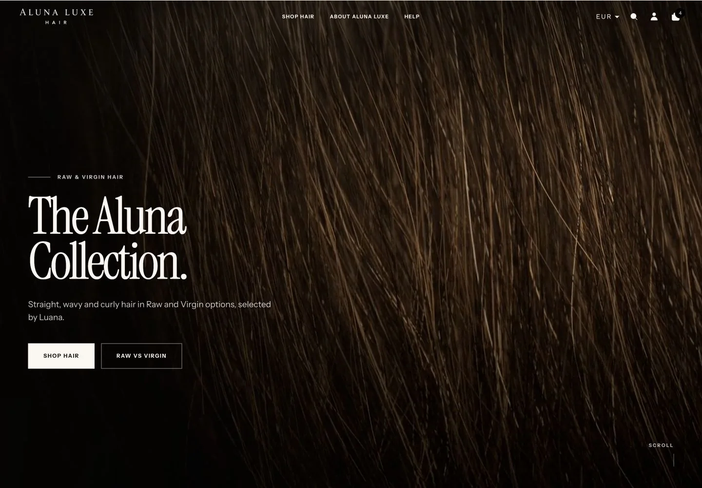
Aluna Luxe Streetline rebuild homepage at the 1440-pixel desktop review width.

Status note
The Streetline rebuild shown here is complete through design, implementation and QA, but remains unpublished. The client’s existing Atelier theme is still the live storefront; all rebuild imagery comes from verified QA captures.

Context

Aluna Luxe is a founder-led hair brand selling Raw and Virgin bundles. The store was already attracting social traffic, but buying premium hair involves several decisions before price becomes meaningful: texture, Raw or Virgin, length and the number of bundles required.

The problem

During the audited 18 July to 17 August 2026 period, Shopify recorded 586 sessions from 520 visitors. Thirteen sessions added a product to cart and seven reached checkout, but none completed an order. The problem could not be reduced to visual polish: mobile presentation, product terminology, promotions, buying guidance and Shopify configuration were not always telling the same story.

Constraints

  • 501 of 586 sessions were mobile, so mobile could not be secondary
  • Raw and Virgin had to be explained without inventing unsupported quality claims
  • Origin, lifespan, bleaching, processing and performance claims could only be published when evidence supported them
  • Existing Shopify products, apps, policies and commerce rules had to be worked with rather than hidden
  • The rebuilt theme had to remain unpublished while launch blockers and client approvals were unresolved

Key decisions

Audit before redesigning

Authenticated Shopify inspection established a shared source of truth for products, pricing, promotions, inventory, shipping and customer-facing content before visual decisions were made.

Design around buying decisions

The journey was organised around the sequence a customer needs: choose a texture, understand Raw versus Virgin, choose a length, then decide how many bundles are appropriate.

Treat mobile as the primary journey

With 501 of 586 audited sessions coming from mobile, the phone experience became the main design constraint rather than a desktop layout reduced at the end.

Publish only what could be defended

Confirmed product facts were used, while origin, lifespan, bleaching and universal performance claims were deliberately withheld when the available evidence did not support them.

Traffic was arriving. Orders were not.

The existing store already had attention, including traffic from Instagram and TikTok. This was not a zero-traffic problem, and the audited numbers establish the commercial baseline without claiming why customers did not purchase.
Visitors
520
18 Jul – 17 Aug 2026
Sessions
586
18 Jul – 17 Aug 2026
Mobile sessions
501
18 Jul – 17 Aug 2026
Added to cart
13
Sessions
Reached checkout
7
Sessions
Completed orders
0
18 Jul – 17 Aug 2026
Sales
€0
18 Jul – 17 Aug 2026
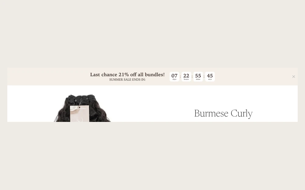
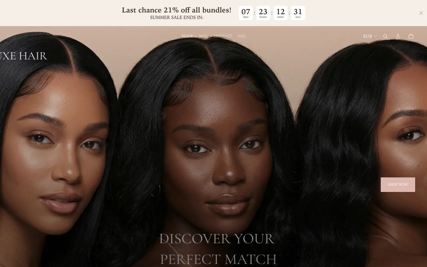
Original Aluna Luxe desktop storefront with a countdown banner, three-model hero and Discover Your Perfect Match message.
The published Atelier storefront during the pre-rebuild evidence period.

Authenticated Shopify figures from the pre-rebuild period. No matched post-launch comparison exists yet.

The rebuild started with evidence, not aesthetics.

The storefront and Shopify admin did not always describe the same commercial reality. The audit focused the rebuild on observable issues: weak mobile hero framing, customer guidance that rendered blank, navigation that disappeared over light product media, inconsistent option terminology and promotional presentation that did not consistently match actual variant pricing.
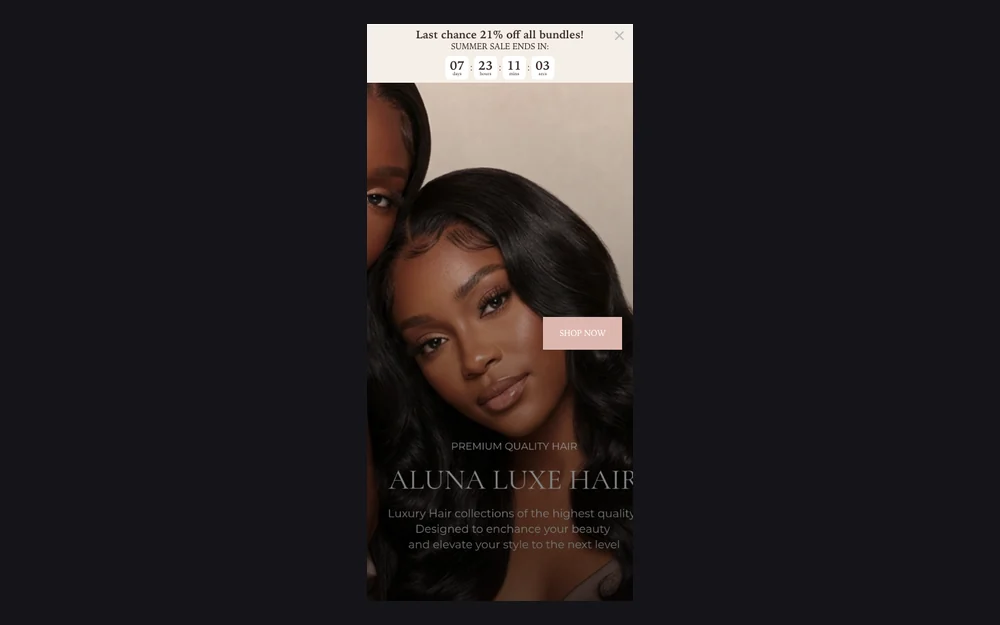

Original mobile homepage hero tightly cropped around a model’s face with the Shop Now button across the image.
Mobile presentation before the rebuild did not frame the product or message cleanly.
Original public Hair Knowledge Guide page showing a blank white content area.
The Hair Knowledge Guide had content in Shopify but rendered blank publicly.
Original product page header rendered faintly against pale product photography and a white background.
Navigation and product identity lost contrast over light product imagery.
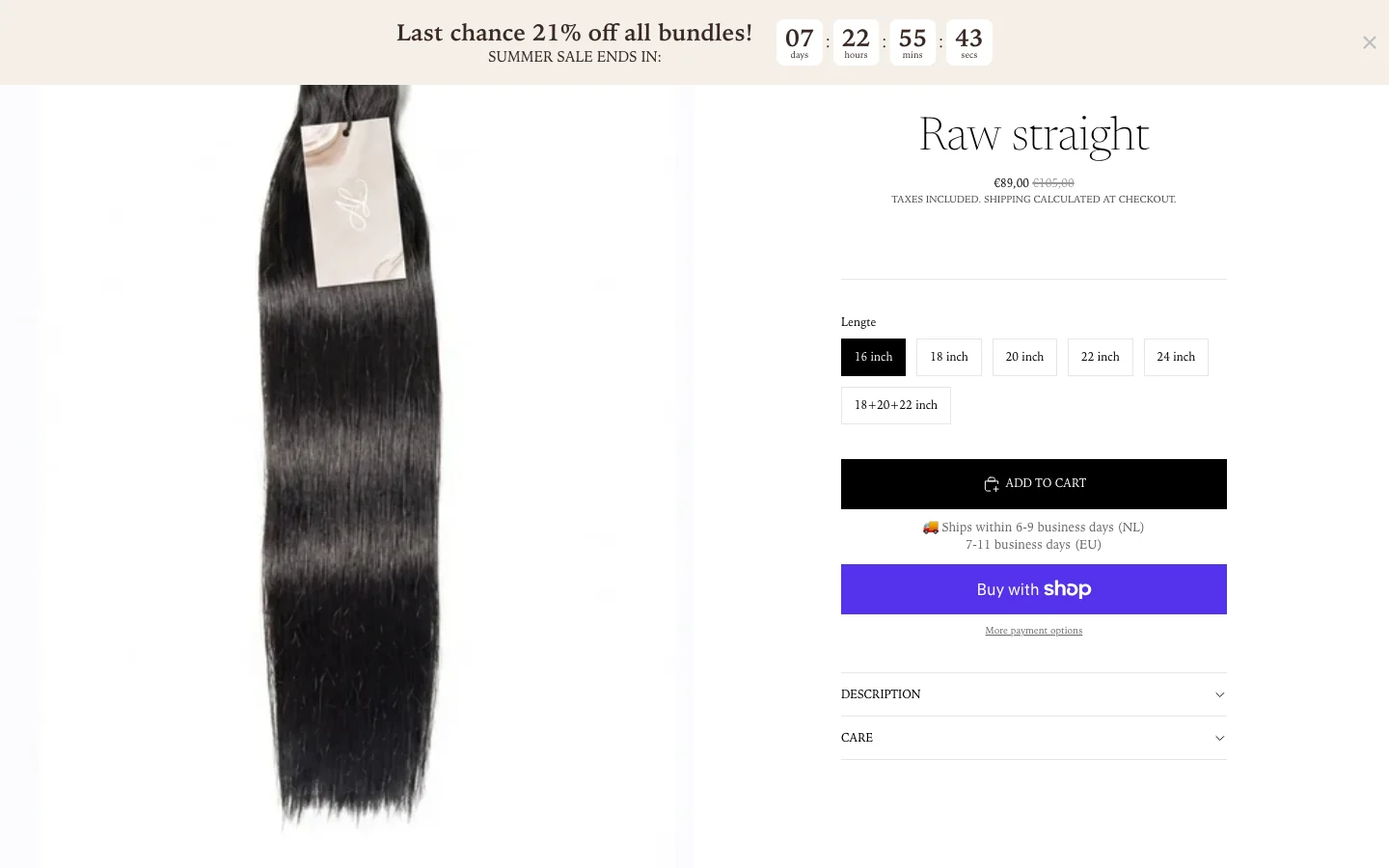
Original Raw Straight product page beneath a sitewide 21 percent promotion banner with variant pricing controls visible.
Historical promotional presentation and actual variant pricing were not always aligned.

Make the product easier to choose.

Premium hair is not a simple one-click SKU decision. A shopper needs to understand texture, Raw versus Virgin, length and bundle quantity, so the rebuild turned those choices into explicit customer journeys rather than expecting specialist knowledge at the start.
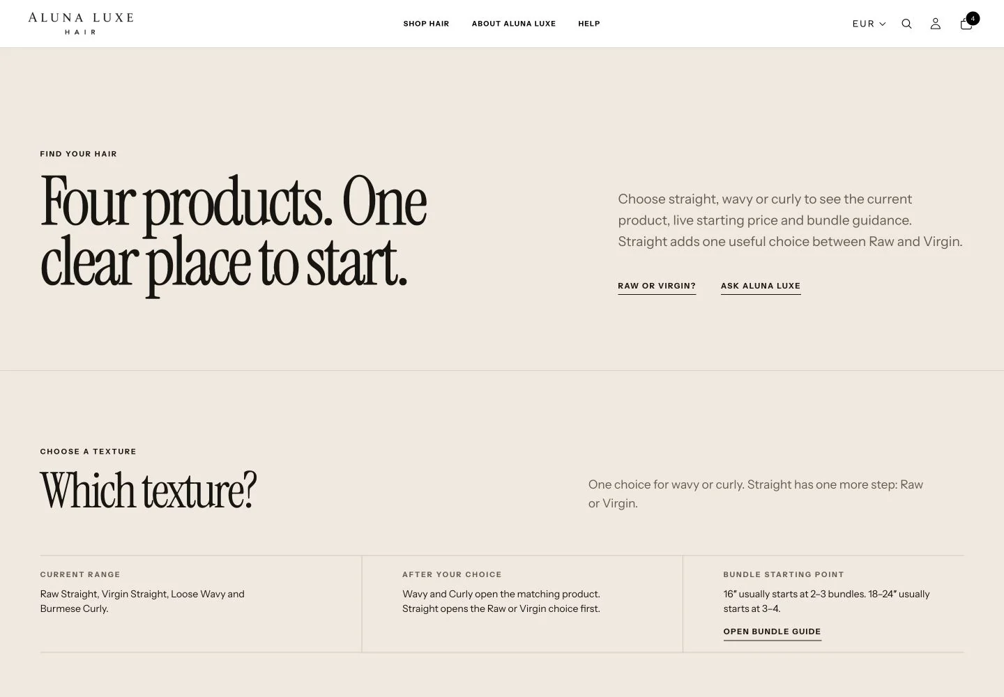
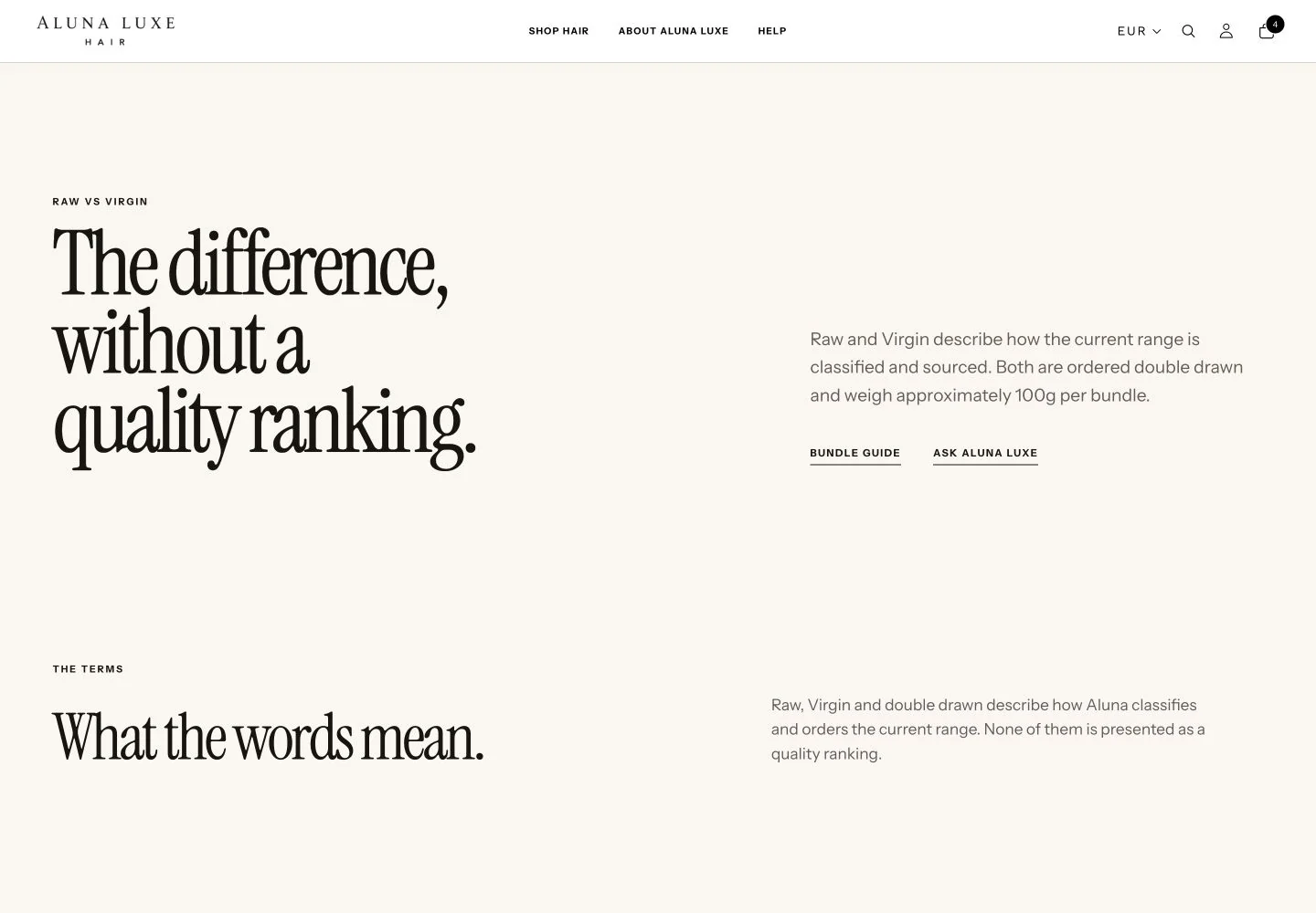
Find Your Hair page mapping straight, wavy and curly textures to the four available products.
Texture becomes a clear starting point, with the next decision shown only where it is needed.
Raw versus Virgin guide explaining current classifications without ranking one as universally better.
Raw and Virgin are explained as classifications using the product facts available to publish.
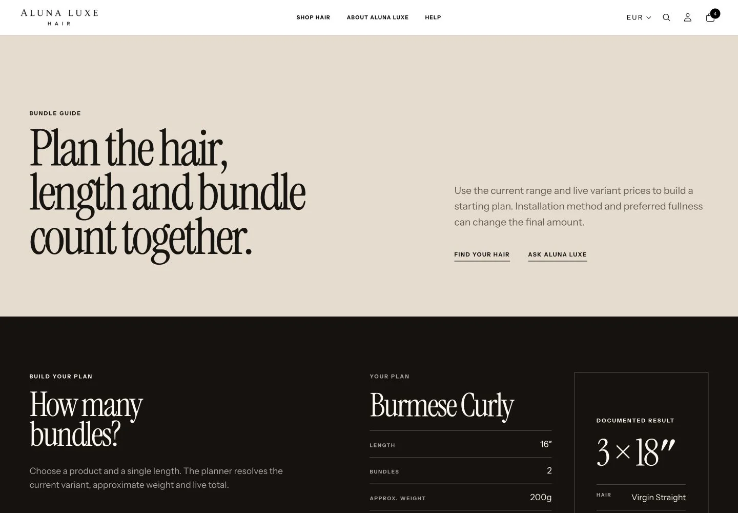
Bundle Guide combining hair type, length, bundle count, approximate weight and current price.
Bundle guidance brings length, quantity, approximate weight and current price into one planning step.

Bring the buying decision into the product page.

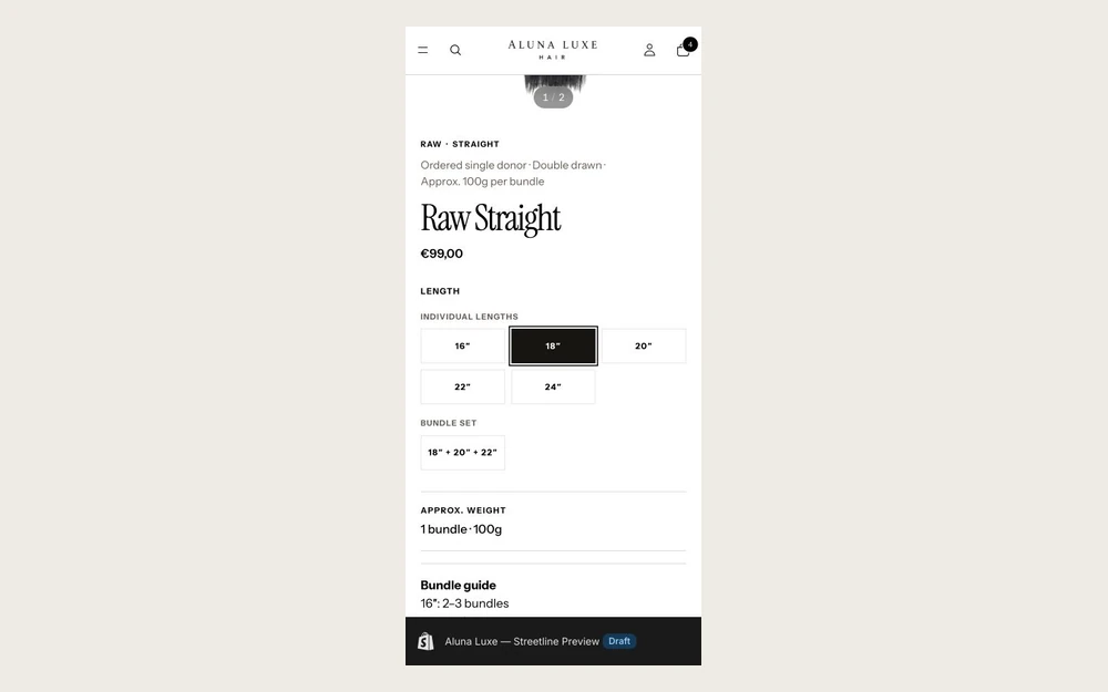
The rebuilt product page brings the information needed to decide closer to the purchase action: Raw or Virgin classification, approximately 100g per bundle where confirmed, length choices, bundle-count guidance, quantity and verified payment or reassurance information.

Product-specific facts are structured around the selection itself, without adding unsupported origin, lifespan, bleach-to-613, zero-tangle or universal processing guarantees.
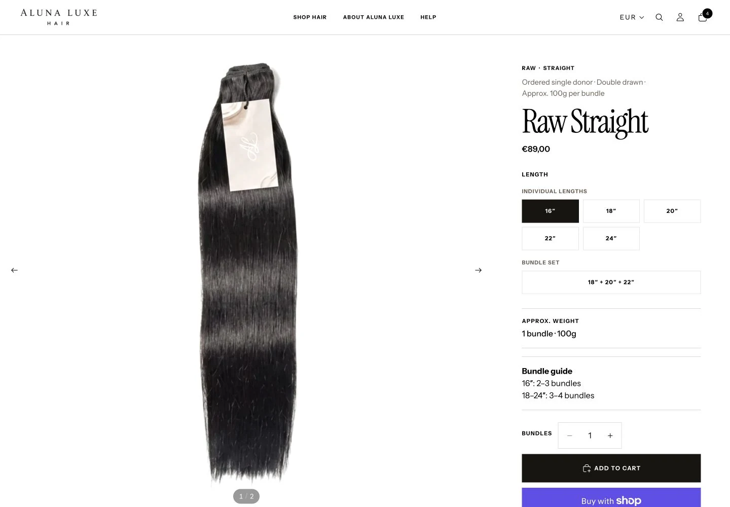
Raw Straight desktop product page with gallery, classification, length choices, bundle set, weight guidance, quantity and purchase controls.
Desktop product structure keeps product facts and selection controls beside the purchase action.
Raw Straight mobile product page with 18-inch selection, approximate weight and bundle guidance visible together.
On mobile, the classification, selected length and bundle guidance stay within the active buying flow.

Design around the 85.5% majority.

501 of 586 sessions in the audited window were mobile. The phone experience therefore became the primary design constraint rather than a desktop layout reduced at the end.
Mobile share
85.5%
18 Jul – 17 Aug 2026
Mobile sessions
501
Of 586 sessions

Before

Original mobile hero with a tight portrait crop and Shop Now button placed across the image.
Before — the mobile opening did not frame the product or message cleanly.

After

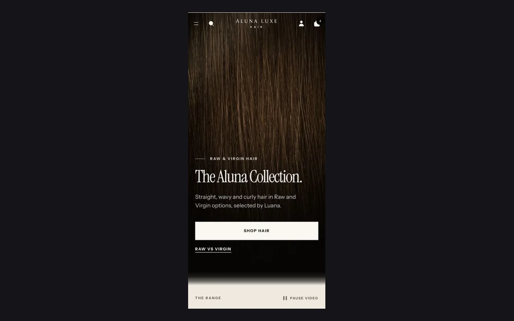
Streetline mobile homepage hero with Aluna Collection headline, product framing and two clear shopping actions.
After — hierarchy, framing and the primary shopping action were designed for the phone viewport.

Premium copy without invented claims.

Part of the work was deciding what not to say. Confirmed product information was separated from assumptions and supplier-style marketing language. Raw or Virgin classification, ordered double drawn, approximately 100g per bundle, bundle guidance and verified shipping or payment information could be used where supported.

Claims around exact origin, lifespan, bleaching and universal processing behaviour were withheld where the available evidence was not sufficient. That does not establish that those claims are false; it keeps the storefront from presenting uncertainty as fact.

Where the evidence was incomplete, the storefront says less rather than inventing certainty.

A storefront is not finished when the homepage looks good.

Release QA covered the customer journey rather than only static desktop screens. The retained evidence records navigation, the mobile drawer, product selection, Raw versus Virgin guidance, bundle planning, cart states, payment presentation, responsive overflow, video behaviour, reduced motion, search, account states and third-party commerce integrations.

The process reviewed the rebuild at 390, 430, 768 and 1440 pixels and intentionally surfaced remaining release blockers instead of manufacturing a perfect score.
Retained visual QA captures
206
Primary responsive widths
4
Live products reviewed
4
Verified Aluna Luxe rebuild homepage at the 390-pixel mobile review width.
390px mobile evidence retained from the final visual release review.
Verified Aluna Luxe rebuild homepage at the 768-pixel tablet review width.
768px tablet evidence checked for hierarchy, spacing and overflow.
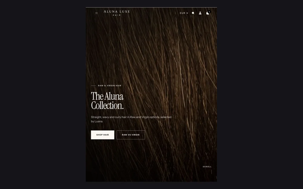
Verified Aluna Luxe rebuild homepage at the 1440-pixel desktop review width.
1440px desktop evidence from the same retained release set.

QA surfaced commerce, search and legal or configuration issues that still need closure before the client publishes the rebuild.

Evidence so far

Evidence being collected

  • Verified pre-rebuild baseline. Authenticated Shopify data established the 18 July to 17 August funnel: 586 sessions, 13 add-to-cart sessions, seven checkouts reached and no completed orders.
  • Responsive release evidence. The rebuild was reviewed at 390, 430, 768 and 1440 pixels with retained visual evidence and interaction checks.
  • Launch findings. QA identified remaining commerce, search and legal or configuration issues that must be closed before publication.

Where it stands

The Streetline Shopify rebuild is complete through implementation and broad design, responsive and interaction QA. Theme 205402341718 remains unpublished while the client’s Atelier theme 198293913942 is live, so commercial performance cannot yet be compared with the documented pre-rebuild baseline.

Next move: Publish the approved rebuild when the client is ready, then collect a matched post-launch measurement window before drawing conclusions about commercial impact.

  • VIPONSSI V2 camera startup at the desktop breakpoint.
    VIPONSSI V2 camera startup at the mobile breakpoint.
    Desktop and mobile interface previews
    Client project · In progress

    VIPONSSI

    The brand needed a digital presence with the same point of view as the clothes.

    Digital experiencesIdentity-led digital experience
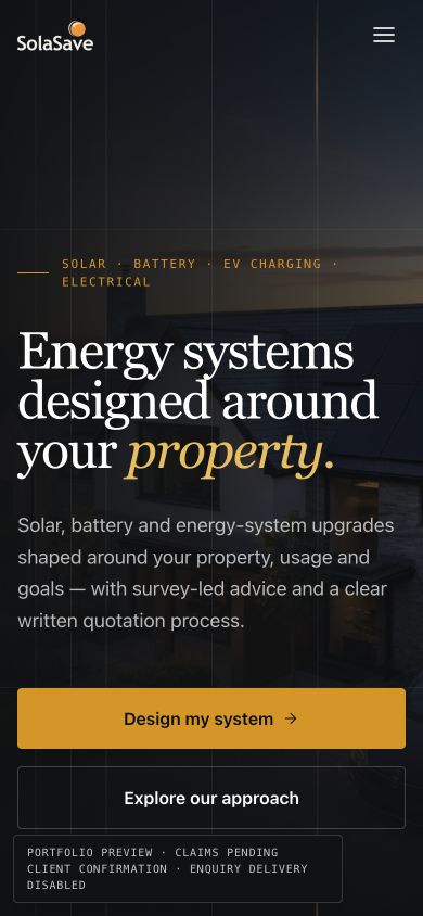
  • Solasave responsive pre-launch website at the desktop breakpoint.
    Solasave responsive pre-launch website at the mobile breakpoint.
    Desktop and mobile interface previews
    Client project · Pre-launch

    Solasave

    Customers need to understand the services and trust the claims before they enquire.

    Systems · Digital experiencesBusiness website and enquiry journey
    Open pre-launch build

Facing a similar constraint?

Explain what is happening now and where the current setup falls short.